
• ECDC Branding

    For the Effingham Child Development Center, I designed a rebranded identity that balances professional trust with childlike playfulness, reflecting their mission of nurturing children of all abilities in an inclusive environment.

This updated branding combines trustworthy professionalism with childhood fun. Some key highlights include:

  • The logo showcases the breadth of ECDC’s services through the shilouette of growing children.

  • The color palette is inspired by the local schools, which grounds the brand in it’s community.

  • The use of fonts Montserrat and Courier Prime gives the brand options to throw in some fun without losing legibility.
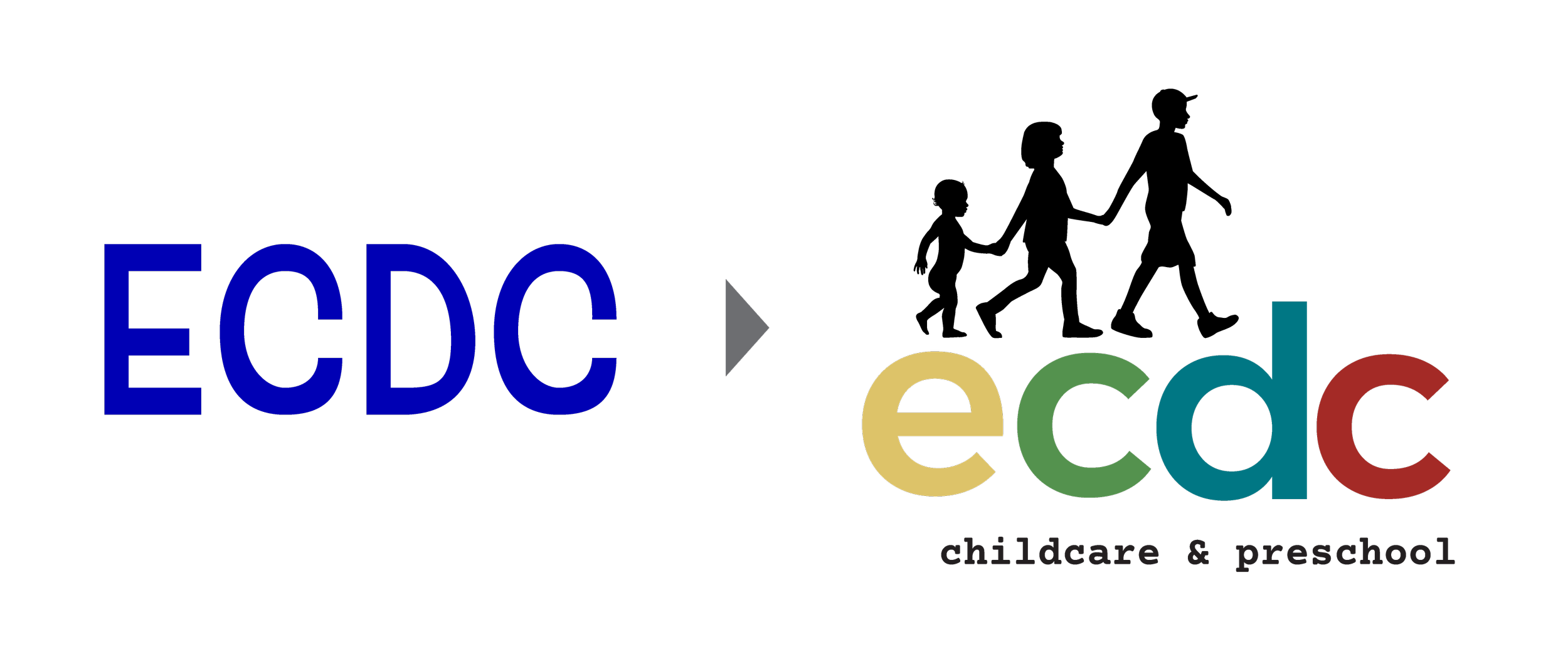
Colorful logo for ECDC childcare and preschool with stylized overlapping letters and an arrow
Colorful logo with the word 'ecdc' in lowercase letters, a black silhouette of children walking holding hands, and the text 'childcare & preschool' underneath.
A table showing different paint colors with their names and hex codes, including gold, dark gold, olive, dark olive, teal, dark teal, crimson, and dark crimson. The table has color swatches matching each name and hex code.
Brochure and letterhead for ecdc childcare & preschool featuring a logo of children holding hands, with colorful abstract shapes in the background.
Screenshots of a website and a photo promoting an early childhood development center. The website features children reading books and has menu options for about, parent information, contact, calendar, and donations. The photo shows a group of smiling children outdoors with the text "Open Hearts For All" and a URL for more information.